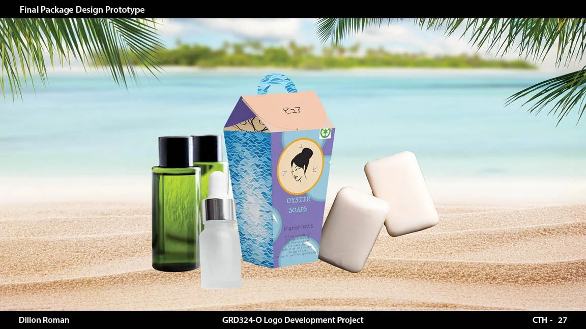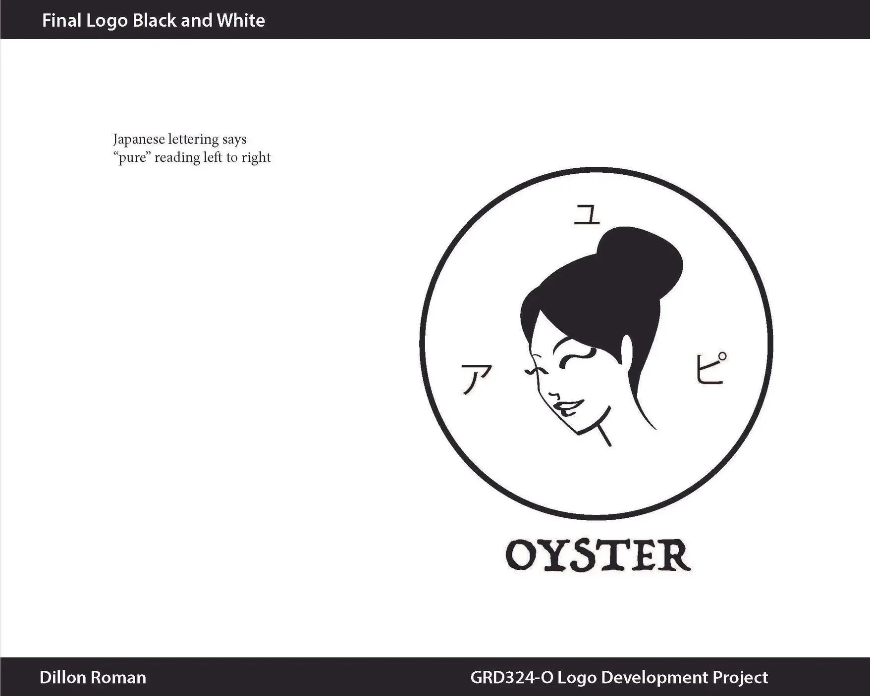
my graphics in business and client briefs…
Client brief in graphic design:
A foundational document outlining a project's goals, scope, target audience, budget, and timeline. Created collaboratively by the client and designer, it serves as a roadmap to align expectations, provide creative direction, and ensure the final design solves specific business needs.
Phase 1: client Briefing
Before I open any design software, I gather everything I need from the client. A weak brief leads to endless revisions, so I don't skip this step.
Your business — what you do, who you serve, and the story behind it
Your audience — who you're trying to reach and what resonates with them
Your competitors — what's already out there, and how we can stand apart
Your style — words that describe your brand (bold? elegant? playful? minimal?), logos you love, and ones you don't
Where your logo will live — website, packaging, signage, apparel, app icons — so I design something that holds up everywhere
Your practical needs — timeline, budget, number of concepts, and revision rounds
This step matters more than people realize. The better I understand your brand, the less time we spend going back and forth later — and the stronger the final result.
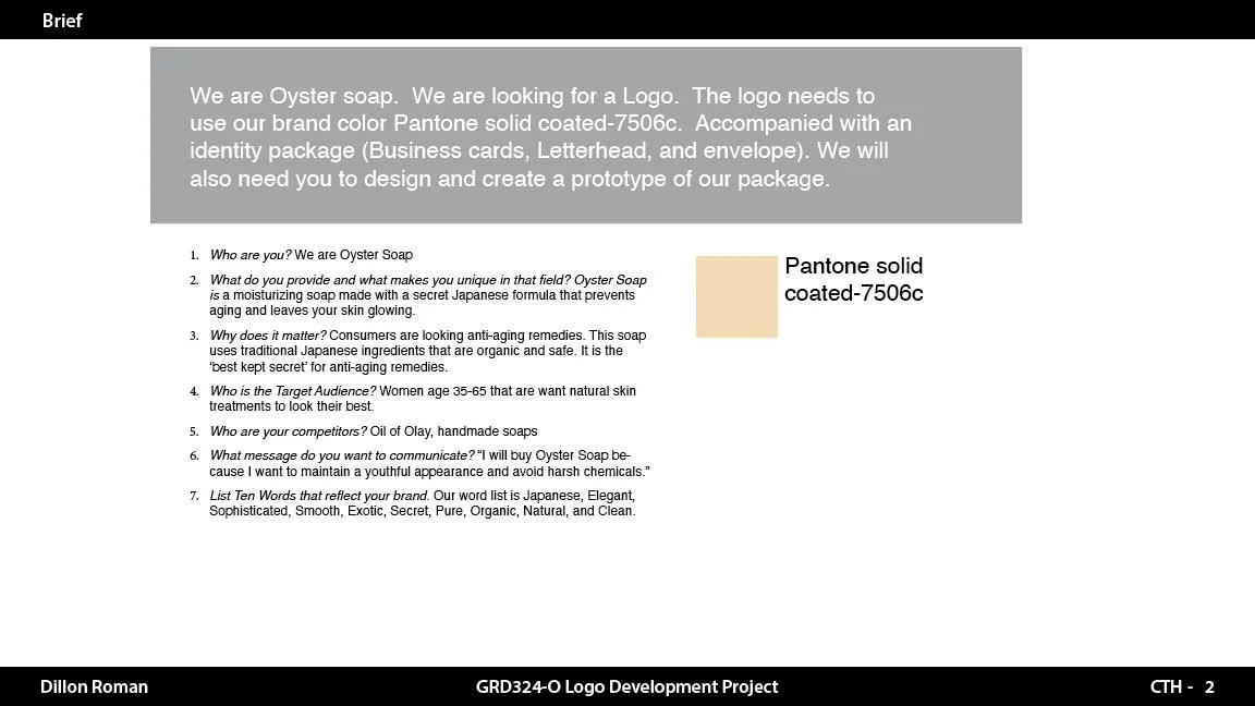
Below is an example of a small client brief questionnaire that I provided for Oyster Soaps. This allows me to get a quick scope of the project I am taking on.
Phase 2: Step-by-step design
-
I study competitors, industry visuals, and the client's stated inspirations, then build a mood board to confirm direction before designing (I send this for quick approval).
-
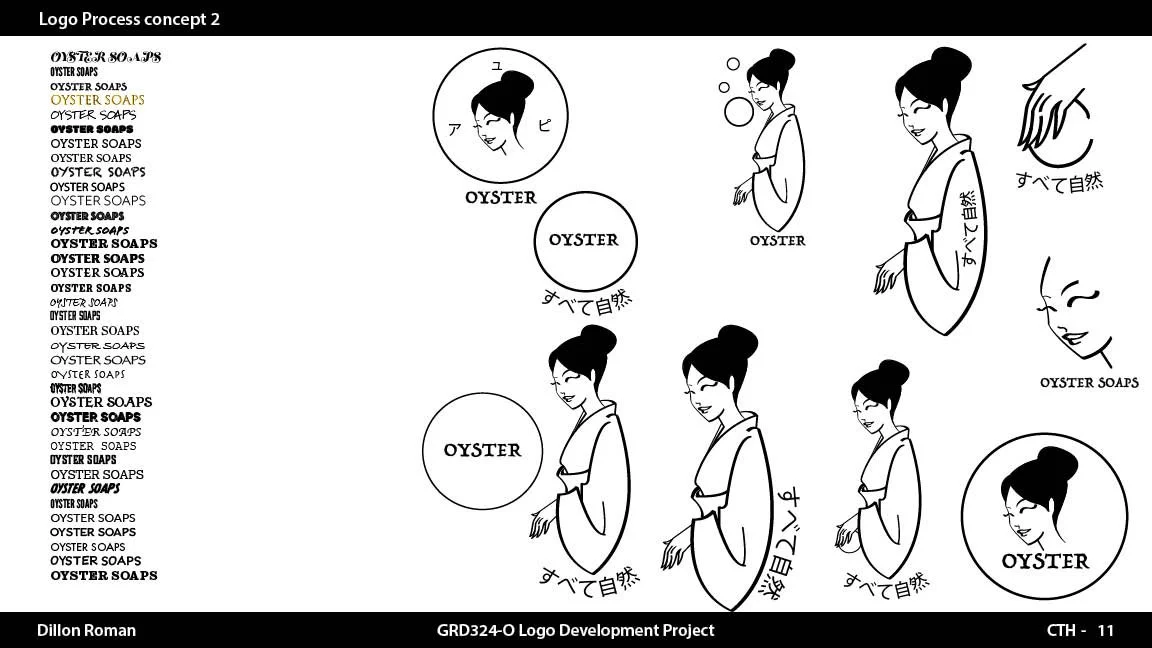
I do rough thumbnail sketches (digital or hand-drawn) exploring multiple concept directions. Quantity over polish at this stage.
-
I narrow down to the 2–4 strongest directions and develop them digitally in vector form (black and white only, no color yet — this tests if the mark works on shape alone).
-
I build clean vector versions in Illustrator of the shortlisted concepts, refining proportions, spacing, and line weight.
-
I present concepts (typically 2–3) with rationale for each — why the shapes, style, and direction support the brand. I avoid showing too many options; it dilutes decision-making.
-
The client selects a direction or gives feedback, and I revise based on the agreed revision rounds.
-
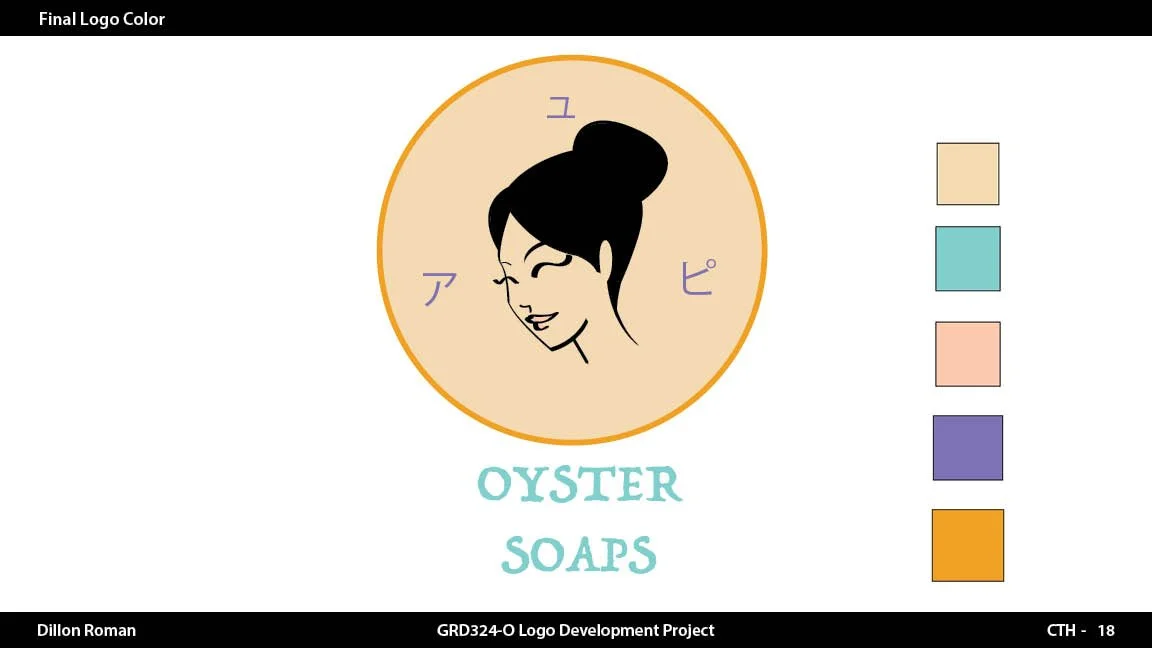
Once the mark is locked, I develop the color palette (primary, secondary, accent) and test it on light/dark backgrounds.
-
I select or customize typefaces for the wordmark/tagline to properly encapsulate your company’s “vibe” (so-to-speak) which you would like to portray
-
I polish curves, kerning, alignment, and optical balance, and test at small sizes (favicon, app icon) and large sizes (signage).
-
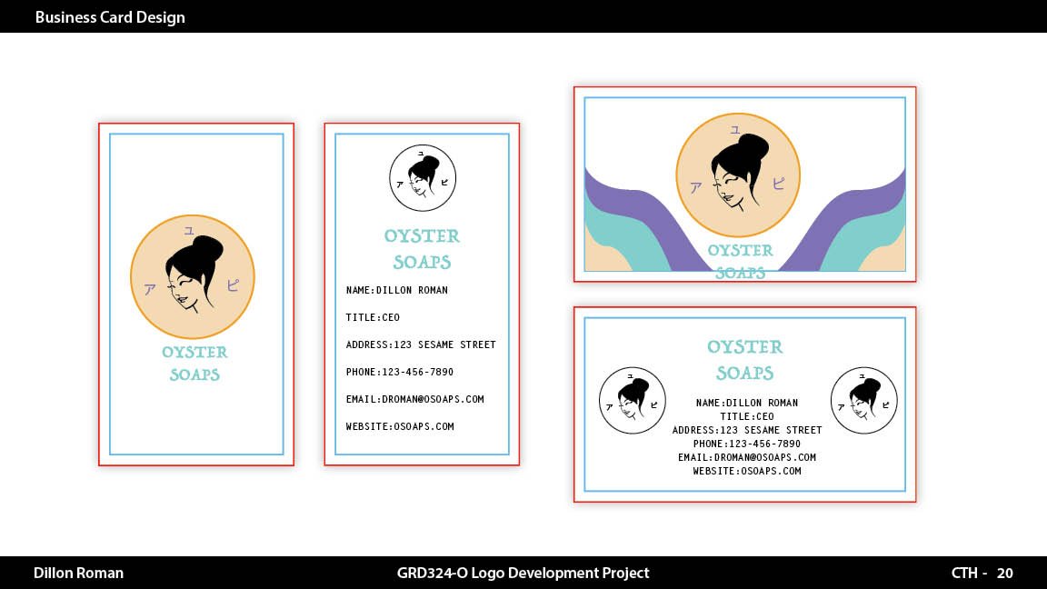
I show the logo in real-world context (business card, website header, packaging, signage) so the client can visualize it in use.
-
The client signs off on the finished mark.
-
I export and package all files (see Phase 3).
-
I document proper usage, spacing, minimum sizes, and misuse examples.
Phase 3: Final logo packaging
Every logo project I deliver includes a complete, professional package:
A simple usage guide covering your color codes (HEX, RGB, CMYK), fonts used, spacing rules, and minimum size — so your logo stays consistent no matter who's using it.
Everything is organized into clearly labeled folders and delivered through a shared drive link, ready to hand off to your web developer, printer, or team.
-
.AI — Adobe Illustrator source file (editable, layered)
.EPS — universal vector format for print/sign shops
.SVG — scalable vector for web/digital use
.PDF — vector, print-ready
-
.PNG — transparent background, high resolution (for web/digital use)
.JPG — white/solid background version (for use where transparency isn't supported)
-
Full color version
Black (all-black) version
White (reversed/knockout) version — for dark backgrounds
Grayscale version
-
Primary/full lockup (icon + wordmark)
Icon/symbol only (for app icons, favicons, social avatars)
Horizontal lockup
Stacked/vertical lockup
-
Brand style guide or one-page usage sheet: color codes (HEX, RGB, CMYK, Pantone), typography used, clear space rules, minimum size, do's and don'ts
Font files or names/links if custom typography was used
-
Files organized into folders by format (Vector, PNG, JPG) and by color variation
Delivered via cloud folder (Drive/Dropbox) or zipped file with a clear naming convention (e.g., BrandName_Logo_FullColor.png)